Rain Man Poster Analysis
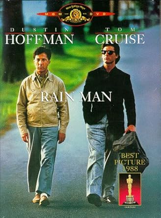
Above is the poster for Rain Man, a poster that heavily inspired us for the River poster. This poster is really simplistic in design; it's not packed to the brim with quotes from the film or from reviews. It simply has the two main characters walking down the street, with their names and the title of the film.
It makes use of the Z rule. You can see the actors names along the top, the title and the two characters in the middle and the award that it won in 1988 for Best Picture. The two characters are the focus of the poster, however. You can see them walking side by side down a road towards the camera. This obviously sets these two characters as the focus of the film. The main theme of the film is companionship and I think that this poster reflects that well. The two characters are walking beside each other, indicating that they're getting closer to each other, however Tom Cruise's character walks with his right and in his pocket; perhaps indicating a slight reluctance to bond with his brother. After all, he didn't even know he had a brother and his father had left his inheritance to him, which is a rather substantial sum of money.
The simplicity of this poster is what makes it so good, in my opinion. There's no need for flashy graphics or quotes. This is something that I wanted to replicate when making our poster. Having our two characters in the poster by themselves lets the audience know that the film is about these two characters and focuses on them. As well as this, having our two characters face away from the camera removes the warmth from the image. In the Rain Man poster, being able to see the characters' faces allows you to feel comfortable with the characters before you even see the film or know what it's about. In the River poster, it further adds to the ambiguity of both characters and still allows for the viewer to come to their own conclusions about the characters.


Comments
Post a Comment